Color Palette Science serves as the technical foundation that prevents expensive design revisions and project delays in high-end kitchen builds. A failure to synchronize stone textures and tones often results in a visual disconnect that compromises the asset value of the property. When designers ignore the underlying interaction of light and material, they risk a finished product that feels cluttered, leading to client dissatisfaction and the potential for costly material replacements.
This guide provides the specifications for pairing white quartzite with stainless steel and integrating charcoal stone into modern layouts. We examine specific methods for balancing busy granite patterns and selecting the correct color temperatures for backsplashes to ensure long-term design stability. These standards help teams navigate the transition between cool-toned appliances and warm stone selections while maintaining a professional finish across every surface.
Why Your Countertop Should Dictate Your Stone Backsplash Choice?
Professional kitchen design logic dictates that the countertop acts as the primary visual anchor, requiring the stone backsplash to align with its established color temperature and pattern density to avoid aesthetic conflict.
Harmonizing Undertones Between Surfaces
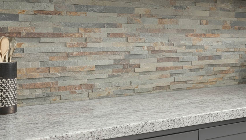
Color science requires the stone backsplash to follow the established color temperature of the horizontal workspace. When we source materials for large-scale B2B projects, we prioritize matching the secondary minerals in the countertop to the primary hue of the ledger panels. Pairing warm countertops with gold or beige hues, such as our Golden Honey or California Gold series, ensures a unified aesthetic that feels intentional rather than accidental.
Cool-toned quartz or marble surfaces pair most effectively with Arctic White or Sierra Blue stone panels. Maintaining professional color consistency prevents the “clashing neutrals” phenomenon where two different stone types compete for dominance. Identifying the subtle flecks in granite allows for precise stone selection that highlights natural details without overwhelming the room’s palette.
Managing Pattern Intensity and Visual Clutter
Balancing the movement of countertop veining with the texture of stacked stone prevents the kitchen from appearing overcrowded. Heavy granite patterns require a cleaner, more structured backdrop. In these scenarios, we recommend the Flat Series to provide a sophisticated environment that doesn’t compete for visual attention. Conversely, solid-color or subtly veined countertops allow for the use of the Rough Series, where deep textures and shadows create a necessary focal point.
| Countertop Visual Profile | Backsplash Texture Choice | Recommended Model |
|---|---|---|
| Busy / High-Movement Granite | Flat Series / Z-Shape Interlock | Carbon Black Slate |
| Minimalist / Solid Quartz | Rough Series (Up to 3.5cm) | Glacier White Quartzite |
| Warm / Gold Veined Marble | Natural Cleft Split-Face | Golden Honey Quartzite |
- Designers prioritize one “hero” element to maintain sophisticated balance between surfaces.
- The Z-Shape interlocking system camouflages vertical joints, essential when pairing with smooth slabs.
- CNC diamond-blade edges ensure the stone fits tightly against the countertop’s back edge.
Lighting Dynamics on Horizontal and Vertical Planes
Countertops receive the most direct illumination in a kitchen, and this light reflects onto the backsplash, altering how stone textures appear. Horizontal surfaces set the baseline for brightness, which influences the perceived depth of ledger panel shadows. Under-cabinet lighting interacts with the countertop’s reflectivity to highlight the natural clefts in our stacked stone, making the selection of light-absorbing or light-reflecting stone critical for the final atmosphere.
Establishing a Material Hierarchy
We view the countertop as the workspace foundation, while the stone backsplash serves as its architectural extension. Because the countertop’s durability and price point typically make it the first decision in a 2026 kitchen remodel, the backsplash must adapt. Using our Pencil Series stone creates a linear flow that complements the smooth edges of modern slab installations. This sequenced material selection ensures the stone backsplash enhances property value by creating a cohesive, high-end look that appeals to professional buyers and homeowners alike.
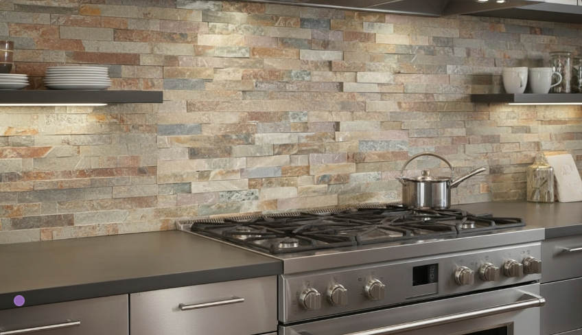
Pairing White Quartzite with Stainless Steel for a Professional Look
The fusion of natural quartzite’s crystalline depth with the clinical precision of stainless steel creates a high-performance culinary environment that balances organic aesthetics with industrial durability.
Balancing Industrial Metal with Natural Stone Texture
Integrating organic stone patterns against sleek metal surfaces defines the high-end contemporary aesthetic for 2026. White quartzite, such as our Glacier White series, provides a unique character that softens the cold, industrial feel often associated with heavy-duty stainless steel fixtures. By selecting the ‘Flat Series’ or linear ‘Pencil Series,’ designers maintain the clean geometry required for modern appliance alignment while introducing a tactile element that metal lacks.
Unlike solid surface materials or engineered quartz, natural quartzite possesses a translucent quality. This allows the stone to interact with the kitchen’s light profile, creating visual depth that complements the reflective nature of professional-grade appliances. This layering of textures ensures the kitchen feels curated rather than sterile.
Meeting Hygiene Standards for Professional Culinary Spaces
Commercial-grade kitchens prioritize sanitation without sacrificing the premium look required for open-concept hospitality venues. While stainless steel remains the standard for food preparation surfaces due to its non-porous nature, quartzite offers a superior, heat-resistant backsplash that withstands the rigors of high-traffic cooking zones. Quartzite naturally resists staining and acid etching better than marble, making it the more practical choice for areas exposed to oils, citrus, and high temperatures.
| Performance Metric | Top Source White Quartzite | Commercial Marble |
|---|---|---|
| Stain Resistance | High (Low Porosity) | Low (Requires frequent sealing) |
| Heat Stability | Excellent (Range-safe) | Moderate (Risk of thermal shock) |
| Chemical Resistance | Resists etching from acidic foods | Highly reactive to acids |
To ensure long-term hygiene, we recommend using high-strength epoxy resin during the installation of our interlocking Z-panels. This technique creates a permanent bond that prevents moisture and grease buildup behind the stone panels, a critical requirement for maintaining air quality and sanitation in professional environments.
Maximizing Reflective Light in Modern Workspaces
Combining polished stainless steel with light-colored quartzite dramatically enhances the brightness of a room. This material duo bounces both natural and artificial light, making compact kitchens feel expansive and inviting. The natural crystalline structure of our white quartzite models creates a subtle shimmer that interacts with the metallic sheen of professional appliances, improving visibility in prep areas without the need for high-wattage, energy-intensive lighting.
- Polished quartzite surfaces reflect light evenly across the vertical plane.
- White minerals minimize “shadow pockets” in under-cabinet zones.
- The 95% hue uniformity in our quarry-source batches ensures consistent light distribution.
Long-Term Performance in High-Traffic Environments
Professional environments require materials that withstand heavy daily use while maintaining their original appearance. Natural quartzite does not fade from UV exposure, ensuring the backsplash remains crisp and white even when placed near large windows or under intense indoor lighting. Our interlocking Z-panel system provides a seamless installation that handles the vibrations and temperature shifts common in busy kitchens without cracking or delaminating.
Maintenance is straightforward, requiring only pH-neutral solutions to keep both the stone and the steel looking new. This low-maintenance profile protects the investment of hospitality operators and homeowners alike, ensuring the “professional look” endures for years of service.
Premium Natural Stone Panels for Profitable Projects
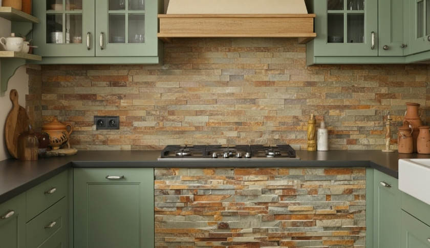
Warm Earth Tones: Bringing the Mediterranean Feel to the Kitchen
Mediterranean kitchen design in 2026 moves away from sterile minimalism, using natural mineral textures to anchor palettes of terracotta, sage, and ochre for an authentic, lived-in feel.
Current kitchen trends favor earthy foundations that evoke warmth and history. Selecting stone panels featuring natural ochre and tan hues—such as California Gold or Golden Honey from our Big 10 inventory—complements the classic Mediterranean color scheme. Combining these stacked stone textures with sage-colored cabinetry balances rugged stone surfaces with soft, natural tones. We ensure color depth remains vibrant by sourcing material from the same quarry layer per order, preventing the “patchy” appearance found in lower-tier supplies. Authentic quarried stone provides a mineral complexity that synthetic alternatives cannot replicate, especially when subjected to the natural light typical of coastal-inspired designs.
Enhancing Authenticity Through Deep Textural Shadows
Traditional Mediterranean aesthetics rely on high-dimensional surfaces to provide character. Our Rough Series stone panels utilize natural split stone depths reaching up to 3.5cm, creating dramatic shadows and a rugged feel reminiscent of old-world masonry. This visual weight transforms kitchen feature walls or fireplace surrounds into architectural focal points. By incorporating organic textures that replicate artisanal masonry, designers provide a tactile experience that bridges the gap between the indoors and the natural world.
- Natural cleft and split-face finishes provide the high-contrast shadowing necessary for rustic authenticity.
- Variation in panel thickness from 1 to 1.75 inches ensures a non-linear, hand-assembled look.
- Real stone minerals maintain UV stability, ensuring the “warmth” of the stone does not fade under direct sunlight.
Merging Traditional Aesthetics with Modern Panel Efficiency
Design innovation in 2026 focuses on blending artisanal elements with high-performance functional requirements. We implement interlocking Z-shaped panel systems to achieve a seamless look, utilizing a male-female connection that eliminates the visible vertical joints common in standard rectangular tiles. These panels are engineered for efficiency; they are lightweight enough to be installed on existing kitchen walls without the need for additional structural footings. CNC diamond-blade precision ensures each panel fits tightly, maintaining the aesthetic of hand-laid stone while significantly reducing on-site labor costs for B2B projects.
Layering Warm Materials for a Cohesive Design
A successful Mediterranean atmosphere depends on layering different materials like stone, clay, and wood to create a sense of history. Pairing a natural stacked stone backsplash with clay plaster walls or handmade terracotta tiles achieves a multi-dimensional, artisanal finish. To protect these surfaces in high-traffic culinary zones, we recommend high-quality sealants that shield the stone from spills while enhancing the natural golden undertones of the minerals.
Lighting plays a critical role in the final presentation. Modern 2026 kitchen lighting plans often use directional LEDs to graze the stone surface from above. This technique highlights the unique ridges and mineral variations of each panel, emphasizing the natural movement of the stone. For commercial projects and high-end residential builds, this material layering provides the durability and visual impact expected in professional-grade environments.
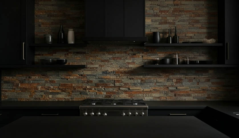
Modern Noir: Using Charcoal Stone for a Dramatic Culinary Backdrop
Deeply textured charcoal stone backsplashes absorb excess light and eliminate glare, providing a high-contrast architectural anchor for professional culinary environments and modern residential kitchens.
Natural charcoal stone provides a visual depth that synthetic alternatives lack. We source our Carbon Black and Midnight Slate from specific quarry veins to ensure 95% hue uniformity across large-scale installations. The split-face texture of the Rough Series creates high-dimensional surfaces where light interacts with natural clefts to produce dramatic shadows, increasing the perceived value of the kitchen space.
Creating Depth with Dark Stacked Stone Textures
Designers in 2026 prioritize materials that offer authentic tactile experiences. Natural stone backdrops serve as a non-reflective, deeply textured base that highlights the sleek surfaces of modern appliances and professional cookware.
- Natural quarry stone provides unique, non-repeating patterns that artificial alternatives fail to replicate.
- The Rough Series creates dramatic shadows and high-dimensional surfaces that enhance the visual weight of the kitchen space.
- Charcoal tones absorb excess light, making them ideal for high-contrast ‘moody’ culinary photography in 2026 design trends.
Selecting Between Flat and Pencil Series for Noir Aesthetics
The choice between Flat and Pencil series determines the kitchen’s visual flow. Both series utilize precision-cut Z-shape or S-shape interlocking panels. This “male-female” connection system, engineered with CNC diamond-blade precision, ensures that vertical joints disappear, creating a monolithic stone appearance across the entire wall.
- The Flat Series offers clean lines and subtle textures for a sophisticated, understated noir look.
- The Pencil Series uses thin, linear stone strips to create a sense of movement and refined detail behind countertops.
- Precision-cut interlocking panels ensure a seamless appearance without visible grout lines, maintaining a solid stone aesthetic.
Practical Benefits of Natural Stone in High-Heat Zones
Durability in high-heat zones remains a non-negotiable requirement for professional kitchens. Unlike engineered materials that may yellow or degrade under heat exposure, natural stone is inherently non-combustible. We use high-strength epoxy resins to bond the stone to the substrate, ensuring stability even under the temperature fluctuations common behind industrial ranges.
- Natural stone panels are non-combustible, making them a safe and functional choice for backdrops behind professional-grade stoves.
- High-strength epoxy resins ensure a permanent bond between the stone and the substrate, preventing pieces from loosening over time.
- UV-resistant properties ensure the deep charcoal color remains permanent and does not fade under kitchen lighting or sunlight.
Maintenance and Longevity for Dark Culinary Surfaces
Protecting the stone’s integrity requires simple but consistent care. While darker stones like charcoal hide daily wear effectively, a high-quality penetrating sealer prevents oils and cooking grease from entering the stone’s pores. Our lightweight panel engineering allows for installation on standard cement boards, removing the need for costly structural wall reinforcements while maintaining the look of traditional heavy masonry.
- Applying a high-quality natural stone sealer prevents oil and water-based stains from penetrating the porous surface.
- Routine cleaning with a soft brush and pH-neutral cleaners maintains the stone’s integrity without damaging the texture.
- The lightweight design allows for installation on standard cement boards without the need for additional structural footings or wall reinforcements.
How to Prevent Your Stone from Looking “Busy” Against Patterned Granite?
Effective kitchen design anchors the space by using the countertop as the primary color reference point, ensuring the backsplash supports rather than competes with the stone’s natural movement.
Match Secondary Tones in Granite Veining
Instead of matching the backsplash to the granite’s dominant background color, designers analyze the surface for subtle flecks or secondary vein colors. Selecting a stone panel that mirrors these accent tones creates a sophisticated, layered effect. This coordination prevents the materials from clashing and makes the backsplash feel like a deliberate extension of the countertop. By pulling a minor gray or beige from within a complex granite pattern, you unify the vertical and horizontal planes without overwhelming the viewer.
| Texture Series | Architectural Effect | Recommended Granite Pairing |
|---|---|---|
| Flat Series (Standard) | Reduces visual noise; uniform 1-2.5cm depth. | High-movement patterns (e.g., Titanium, Titanium swirled). |
| Pencil Series | Provides linear contrast to organic shapes. | Large-scale, swirling organic veining. |
| Rough/Premium Series | High-dimension shadows; adds heavy visual weight. | Uniform, low-variation, or solid-colored granite. |
- Analyze the countertop for subtle flecks or secondary vein colors to guide the stone selection.
- Select a panel shade that matches these accent tones instead of the dominant background color to create a layered effect.
- Using secondary colors ensures the backsplash feels like an extension of the granite rather than an unrelated addition.
Utilize the Flat Series for Visual Balance
Clean lines and uniform depths provide a calm backdrop that anchors high-movement countertops. We manufacture the Flat Series with consistent stone thickness (0.75″ – 1.25″) to reduce dramatic shadows that often make a kitchen feel cluttered. The subtle texture of these panels allows the natural movement of the granite to remain the primary focal point of the culinary space.
- Select the Flat Series to provide a refined, understated surface that does not compete with bold granite patterns.
- Consistent stone thickness reduces the dramatic shadows that can make a kitchen feel cluttered.
- The subtle texture of flat panels allows the natural movement of the granite to remain the primary focal point.
Incorporate Monochromatic Stone Colors
Solid-colored stone panels act as a visual anchor when paired with aggressive stone patterns. Utilizing monochromatic options from our “Big 10 Inventory,” such as Arctic White or Carbon Black Slate, creates a clean, intentional break from multi-colored granite. A single-tone stone surface provides a resting point for the eyes, balancing the complexity of the workspace while highlighting the natural texture of real stone without adding unnecessary color complexity.
- Use monochromatic options like Arctic White or Black Slate to create a clean, intentional break from multi-colored granite.
- A single-tone stone surface provides a resting point for the eyes, balancing the complexity of the workspace.
- Solid colors highlight the natural texture of the real stone without adding unnecessary color complexity.
Scale the Texture Movement Appropriately
Managing the size and direction of the stone pieces creates a professional, organized aesthetic. Large-scale granite patterns pair best with the linear, thin strips found in the Pencil Series, providing a necessary contrast in scale. Maintaining predominantly horizontal movement in the stacked stone offsets the organic, swirling patterns of the granite. Installers should avoid high-dimension “Rough Series” panels if the granite already features heavy visual weight to keep the space open and airy.
- Pair large-scale granite patterns with the linear, thin strips of the Pencil Series to provide a contrast in scale.
- Ensure the movement of the stacked stone remains predominantly horizontal to offset the organic, swirling patterns of the granite.
- Avoid using high-dimension ‘Rough Series’ panels if the granite already features heavy visual weight to keep the space open and airy.

Conclusion
A well-chosen kitchen stone balances color psychology with material consistency to create a cohesive environment. Sourcing natural stacked stone from a single quarry vein ensures visual harmony remains intact across the entire installation. This consistency protects the design’s integrity and eliminates the tonal shifts common in lower-grade materials.
Review the Big 10 inventory to find the most popular North American stone profiles for upcoming projects. Contact our team to request high-definition visual verification or a product catalog for your showroom.
Frequently Asked Questions
What stone color goes best with black granite countertops?
For black granite countertops, high-contrast stones like bright white marble or light gray quartz offer a timeless, sophisticated look. To maintain visual harmony, choose a backsplash stone with minimal veining to balance the countertop’s intensity. If you prefer a monochromatic aesthetic, charcoal or dark slate can create a sleek, modern atmosphere while ensuring the textures remain distinct.
Should my backsplash be lighter or darker than my cabinets?
Industry standards generally suggest choosing a backsplash that is 2-3 shades lighter than your cabinets to create a sense of depth and openness. However, if you have white or light-colored cabinetry, a darker stone backsplash can serve as a stunning focal point. The key is to ensure the stone’s undertones match your cabinets to maintain a cohesive color palette.
Does white stone backsplash turn yellow near the stove?
Natural white stones like marble can occasionally experience “yellowing” near stoves due to the oxidation of internal iron minerals or the accumulation of cooking oils and resins. To prevent this in a 2026 kitchen, ensure the stone is treated with a high-grade, heat-resistant sealer and maintain adequate ventilation to keep surface temperatures and grease deposits to a minimum.
How to mix warm-colored stone with cool-toned appliances?
The most effective way to bridge warm-colored stones with cool-toned stainless steel appliances is through “transitional” elements. Select a stone that features subtle cool-gray veining within a warm beige or cream base. Additionally, using mixed-metal hardware, such as champagne bronze or brushed nickel, helps unify the temperature difference and creates a balanced, intentional design.
What are the trendiest kitchen stone colors for 2026?
In 2026, the trendiest stone colors revolve around biophilic design, featuring deep forest greens, muted terracotta tones, and “warm greige” with heavy, organic movement. High-honed finishes are replacing high-gloss surfaces, with a focus on stones that showcase raw, natural textures and earthy, grounding color palettes that bring the outdoors inside.