De synergie van moderne kasten bepaalt vaak het succes van een renovatie van luxe woningen, omdat een onevenwicht tussen materialen kan leiden tot dure ontwerpherzieningen en projectvertragingen. High-end klanten verwachten een naadloze overgang tussen organische texturen en strak freeswerk, maar toch hebben veel aannemers moeite om deze tegengestelde elementen te integreren zonder visuele wrijving te creëren. Als deze details niet correct worden uitgevoerd, resulteert dit vaak in een onsamenhangende esthetiek die de waargenomen waarde van de hele installatie ondermijnt.
Dit technische gids stelt een standaard vast voor het koppelen van gestapelde stenen met flat-panel kasten, gericht op specifieke kleurblokstrategieën voor wit kwartsiet en donkere houtsoorten zoals eiken en walnoot. We pakken de praktische uitdagingen van het installatieproces aan, inclusief de manier waarop schrijver steen tegen moderne kroonlijsten en de structurele voordelen van het gebruik van grootboeksteen in greeploze keukenopstellingen. Deze workflows bieden de precisie die nodig is om een moderne boerderij-esthetiek te bereiken, terwijl de strakke lijnen behouden blijven die vereist zijn voor hedendaagse architectonische normen.
De spanning van texturen: waarom ruwe steen een aanvulling is op flatpanelkasten
Het architecturale evenwicht in 2026 hangt af van de “tactiel draaipunt”-het gebruik van ruwe, gespleten stenen oppervlakken om de visuele monotonie van hoogglanzende of matte flatpanelkasten te doorbreken.
Visueel contrast tussen natuursteen en geometrische kasten
Flat-panel cabinets define the modern minimalist kitchen, but their smooth, manufactured surfaces often lack the “soul” required for high-end residential appeal. By integrating rough-textured stone, designers introduce a calculated tension between industrial precision and organic imperfection. This juxtaposition ensures that clean-lined environments feel sophisticated and grounded rather than clinical.
- Designers use the tactile nature of split-face stone to provide a focal point against the clean, linear forms of modern cabinetry.
- The juxtaposition ensures that minimalist spaces feel warm and full of character rather than sterile or industrial.
- Natural variations in each stone slab offer unique patterns that flat, manufactured surfaces cannot replicate.
Depth and Shadow Through Split-Face Textures
De Rough Series van Top Source Stone maakt gebruik van extreme diktevariaties om licht te manipuleren. Wanneer installateurs koppelen deze panelen Met LED-strips onder de kast of gerichte inbouwverlichting creëren de 1,75-inch uitsteeksels lange, dramatische schaduwen over de muur. Deze diepte transformeert een tweedimensionale achterwand of accentmuur tot een verschuivend, sculpturaal element dat gedurende de dag verandert.
- Stenen panelen met diktes variërend van 1 inch tot 1,75 inch creëren ze een aanzienlijke dimensionale diepte op kenmerkende muren.
- In elkaar grijpende Z-vormige paneelsystemen zorgen voor een naadloze installatie dat voeglijnen verbergt en de doorlopende natuurlijke textuur benadrukt.
- Strategisch geplaatste verlichting legt de ruige randen van de steen vast en voegt een dynamische laag toe aan de flatpanelomgeving.
Authenticiteit en prestaties van materialen voor interieurs van 2026
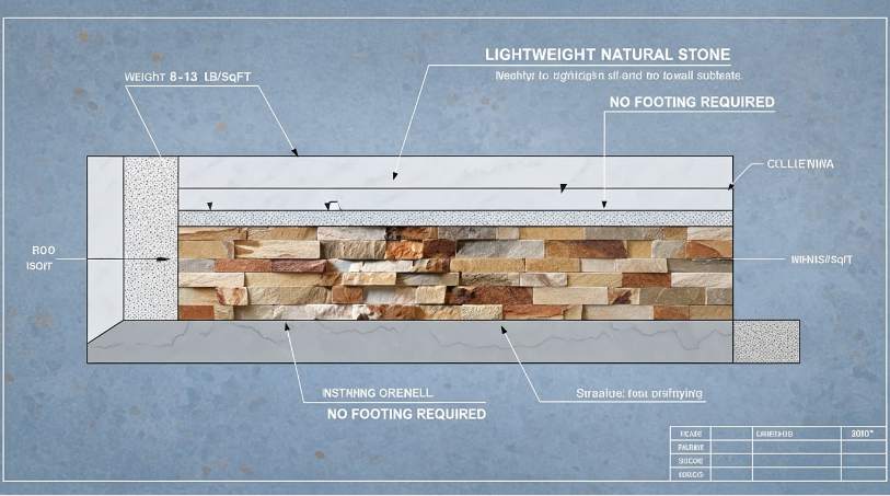
Het specificeren van echte gedolven steen blijft de standaard voor B2B-professionals die prioriteit geven aan de waarde van activa op de lange termijn. In tegenstelling tot op hars gebaseerd “nep” alternatieven, natuurlijk kwartsiet en leisteen behouden hun structurele integriteit en kleurverzadiging onder directe UV-blootstelling. We ontwerpen onze panelen zo dat ze tussen de 8 en 13 lbs per vierkante meter wegen, waardoor ze een robuuste esthetiek bieden zonder dat de structurele funderingen nodig zijn die horen bij metselwerk met een vol bed.
- Natuursteen blijft UV-bestendig en verkleurt niet, met behoud van de kleurintegriteit in zonovergoten woonprojecten uit 2026.
- We gebruiken hoogwaardige epoxylijmen om dit te garanderen steenstuk blijft permanent aan het paneel gehecht substraat.
- Het lichtgewicht ontwerp (8-13 lbs/sqft) elimineert de noodzaak van structurele funderingen, waardoor het een snelle en kosteneffectieve keuze is voor aannemers.
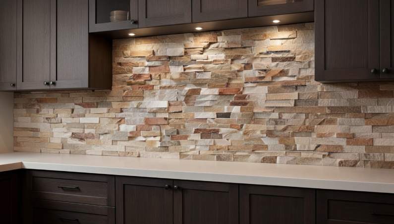
Kleurblokkering: bijpassende witte kwartsiet met donker eiken en walnoot
De verfijnde keukenspecificaties voor 2026 zijn gebaseerd op het agressieve tooncontrast tussen reflecterend wit kwartsiet en diepkorrelige walnoot om ruimtelijke grenzen in open indelingen te definiëren.
Moderne renovaties geven prioriteit aan maximaal tonaal contrast om visueel drama te creëren en ruimtelijke grenzen te definiëren. Wit kwartsiet grootboek steen, such as the Glacier White series, provides a bright, reflective backdrop that emphasizes the deep grains found in dark walnut and espresso-stained oak. This strategy of color blocking with opposing values anchors large open-plan kitchens, directing the eye toward specific architectural features like islands or feature walls. Using natuursteen instead of synthetic alternatives ensures the white tones remain authentic and resistant to UV-related yellowing, a critical requirement for high-end residential projects.
| Design Attribute | Glacier White Quartzite Spec | Dark Wood Complement |
|---|---|---|
| Visual Contrast | High-Reflectivity / Bright White | Deep Espresso / Black Walnut |
| Texture Profile | Natural Split-Face (Rough Series) | Smooth Satin or Matte Veneer |
| Installation System | Z-Shape Interlocking (Seamless) | Handle-less Flat Panel |
Textuurharmonie tussen Ledger Stone en hardhout
Evenwicht tussen de robuustheid van natuursteen met het gladde profiel van donkere houten kasten creëert het een verfijnde overgangsesthetiek. De Rough-serie grootboek steen voegt driedimensionale diepte en schaduwspel toe, waardoor de vlakke, donkere vlakken van moderne notenhouten kasten worden verzacht. Ontwerpers specificeren de Pencil Series vaak voor lineaire details die aansluiten bij de verticale of horizontale nerfpatronen van donker eikenhout. Deze combinatie van biologisch steentexturen en verfijnde houten oppervlakken ondersteunen het biofiele ontwerp van 2026 trends door diverse buitenelementen in binnenruimtes te brengen.
- CNC-diamantbladranden zorgen voor een consistente pasvorm en strakke lijnen, wat zorgt voor een professionele afwerking.
- Door per bestelling uit dezelfde steengroeve te komen, worden natuurlijke kleurverschuivingen geminimaliseerd en voorkomen “fragmentarisch” esthetiek van de muur.
- In elkaar grijpende Z-vormige ontwerpen maken gebruik van een mannelijk-vrouwelijk verbindingssysteem om verticale verbindingen effectief te camoufleren.
Specificatie van wit kwartsiet voor luxe overgangsruimtes
Door de juiste steensoort en afwerking te kiezen, bent u verzekerd van een lange levensduur en waarde van hoogwaardige residentiële en commerciële projecten. Wit kwartsiet biedt superieure duurzaamheid en hittebestendigheid, waardoor het een functionele upgrade is voor open haarden en druk bezochte keukens. Het selecteren van een geslepen of natuurlijke gespleten afwerking vermindert verblinding in lichte ruimtes, waardoor de subtiele grijze nerven van de steen de donkere houten hardware complementeren. Het gebruik van voorgemonteerde, in elkaar grijpende panelen verlaagt de arbeidskosten aanzienlijk en biedt tegelijkertijd een naadloos, professioneel uiterlijk dat steenmetselwerk over de volledige dikte nabootst.
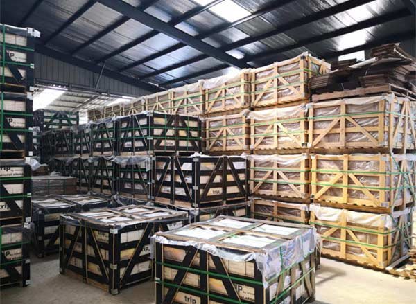
Voor B2B-kopers worden deze panelen geleverd in 5-laags versterkte exportkartons om breuk tijdens het transport te garanderen. Standaard 6″ x 24″ panelen zijn ontworpen voor eenvoudige bediening ter plaatse, waardoor installateurs de onderste rij direct bovenop bestaande kasten kunnen bevestigen zonder dat er extra starterstrips nodig zijn. Deze efficiëntie beschermt de projectmarges en levert tegelijkertijd de resultaten op “Echte steen, Echte waarde” esthetiek waar eindgebruikers op de luxemarkt om vragen.
Premium gestapelde steen voor architectonische uitmuntendheid
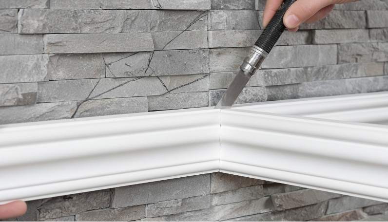
De kloof beheren: steen schrijven om te voldoen aan moderne kroonlijsten
Effectieve integratie van lineaire houtafwerking met onregelmatige natuursteen vereist een mechanische steun en nauwkeurig terugsnijden om architecturale strakke lijnen te behouden.
Het creëren van een stabiele fundering is de eerste stap bij het integreren van kroonlijsten met de onregelmatige profielen van natuurlijke grootboeksteen. We raden aan een steunstrip van masoniet of multiplex achter de vormlocatie te installeren om een consistent bevestigingsoppervlak te verkrijgen. Deze strook fungeert als een brug, waardoor het lijstwerk loodrecht kan blijven zitten, zelfs als het stenen oppervlak eronder in diepte fluctueert. Een vlakke basis voorkomt dat het lijstwerk in de diepe uitsparingen van de kast kantelt “Ruwe serie” texturen, die een dikte van 3,5 cm kunnen bereiken. Voor het beste resultaat zorgt u ervoor dat de steeninstallatie stopt iets onder de uiteindelijke plafondlijn, zodat het lijstwerk waar mogelijk vlak tegen de muurondergrond ligt.
Precision Scribing for Natural Stone Contours
Scribing involves transferring the unique, rugged profile of the grootboek steen onto the wood trim for a custom fit. Use a compass or dedicated scribing tool to trace the stone’s depth variations onto the back of the crown molding. This step translates the organic “gespleten gezicht” texture into a cut line for the carpenter. Installers should use a jigsaw or oscillating tool to back-cut the molding, allowing the front edge to meet the stone tightly while the rear of the wood clears the highest points of the stone face.
| Stone Series | Texture Depth | Scribing Requirement |
|---|---|---|
| Platte serie (standaard) | 1.0cm – 2.5cm | Standard compass scribe; manageable with hand tools. |
| Ruwe/Premium-serie | Up to 3.5cm | Deep back-cutting required; likely needs secondary fillers. |
| Potlood serie | Consistent / Linear | Minimal scribing; best for modern minimalist aesthetics. |
Refining the Joint with Professional Fillers
Even with precise scribing, the transition between stone and wood requires specific finishing materials to maintain a clean aesthetic. Small voids between the scribed wood and the stone can be filled with color-matched caulk or stone-specific epoxy for a seamless look. For larger gaps found in design projects involving high-relief stone, expanding foam can act as a hidden backing before applying a final finish. Avoid using standard wood putty, which often cracks during the natural expansion and contraction of the different materials.
Aesthetic Considerations for Transition Lines
The visual success of the installation depends on how the shadow lines interact with the stone’s texture. Simpler, modern crown molding profiles reduce visual clutter when paired with the complex textures of gestapelde steen. Lighting placement also plays a critical role; top-down LED strips can highlight gaps if the scribing isn’t executed with high precision. Matching the stone’s sealant finish, whether matte or gloss, to the molding’s paint sheen helps unify the two disparate materials into a cohesive architectural element.
Why Handle-less Kitchens Benefit from the Tactile Contrast of Ledger Stone?
Handle-less kitchen design relies on the deliberate removal of hardware to highlight architectural lines, making the tactile depth of natuursteen a necessary counterpoint to prevent a sterile or two-dimensional environment.
Handle-less kitchens rely on flat-panel cabinetry that can sometimes feel sterile or two-dimensional in large-scale residential or commercial layouts. To counter this, designers contrast the sleek, monochromatic finish of handle-less doors with the deep textures and dramatic shadows provided by Rough Series stone. This juxtaposition creates a sensory experience where the absence of hardware shifts the visual focus toward the natural split-face texture of slate or quartzite.
- Integrate Rough Series stone to introduce organic warmth into modern architectural designs that prioritize sharp angles.
- Utilize deep textural shadows to provide visual weight that balances minimalist cabinetry.
- Direct the viewer’s attention to the raw material authenticity facilitated by hardware-free surfaces.
Highlighting Materiality in Minimalist Spaces
In a design where clutter is removed, the quality of the materials themselves becomes the primary decorative element. Authentic quarry stone takes center stage when set against a backdrop of matte or wood-grain finishes. For a more refined approach, the Pencil Series offers a linear flow that complements the horizontal symmetry often found in modern handle-less cabinet layouts.
- Leverage natural color variations to provide visual interest without needing additional accessories or hardware.
- Use the Pencil Series to maintain the clean, horizontal lines characteristic of high-end minimalist kitchens.
- Select premium stone to elevate the perceived value of the surrounding cabinetry and integrated appliances.
Adding Structural Character Without Visual Clutter
Ledger stone provides a high-impact feature wall that aligns with the streamlined philosophy of handle-less design. Interlocking Z-panels achieve a seamless look that mimics the “gap-less” aesthetic of modern push-to-open cabinetry. In smaller kitchen areas where space is a premium, the Flat Series grootboek steen maintains a sophisticated, low-profile appearance while grounding floating elements with a sense of permanence.
- Install interlocking Z-panels to eliminate visible vertical joints and maintain a continuous architectural surface.
- Apply natuursteen backsplashes to provide a durable foundation for floating or handle-less elements.
- Utilize the Flat Series for subtle texture that avoids overwhelming compact or narrow kitchen corridors.
Long-Term Value Through Authentic Stone Finishes
Natural stone offers a durability and authenticity that complements the high-end investment of modern kitchen renovations. Unlike artificial composites that may fade over time, 100% natuursteen retains its color for decades. Pairing luxury handle-less systems with recognized premium materials like the Marble Series increases overall property value while ensuring a low-maintenance environment.
- Avoid the discoloration associated with synthetic alternatives by specifying UV-stable natural minerals.
- Enhance the durability of high-traffic zones with stone surfaces that are naturally humidity and weather-resistant.
- Simplify maintenance with stone that requires only pH-neutral solutions to maintain its original quarry finish.
Creating a Modern Farmhouse Vibe with Light Grey Stone Surfaces
Light grey natuursteen serves as the essential visual bridge in 2026 modern farmhouse design, anchoring airy spaces with organic texture while maintaining a clean, professional aesthetic.
The 2026 modern farmhouse aesthetic relies on light grey stone to bridge the gap between traditional warmth and contemporary clean lines. Light grey stone provides a neutral foundation that avoids the starkness of pure white while maintaining a bright, airy atmosphere. This tonal choice allows designers to create cohesive interiors that harmonize vintage cabinetry with sleek, modern appliances.
Balancing Rustic Textures with Minimalist Tones
Texture functions as a critical design tool in modern interiors, especially when working with monochromatic palettes. Our Rough Series offers deep textures and dramatic shadows that ground the airy farmhouse look with rugged, natural character. This juxtaposition of textured stone with minimalist, clean-lined cabinetry addresses a core design principle: pairing organic materials with geometric forms enhances both elements.
- Real quarried stone adds unique value and authenticity that synthetic alternatives cannot replicate in high-end residential projects.
- Split-face stone panels create visual interest and depth, preventing monochromatic spaces from appearing monolithic.
- Muted colors like Alaska Gray and Glacier White allow the texture to take center stage without overwhelming the kitchen’s color scheme.
Integrating Natural Stone into Open-Concept Layouts
Using light grey surfaces across transitions helps maintain visual flow between kitchen, dining, and living areas. For large-scale interior feature walls and fireplace surrounds, our Flat Series panels provide clean, subtle textures. These surfaces complement various wood finishes, specifically dark oak and walnut, which remain staples of the modern farmhouse palette.
Structural considerations often dictate material choice in open-concept renovations. We engineer thin stone panels weighing between 8-13 lbs per square foot, allowing for installation on standard structural surfaces without requiring additional footings or expensive wall reinforcements. This weight efficiency significantly reduces labor costs while maintaining the premium feel of full-bed stone.
Longevity and Color Stability in High-Traffic Areas
Natuursteen surfaces offer a low-maintenance solution that resists fading and wear over decades of use. Unlike cement-based artificial stone which often fades or delaminates, natuursteen remains UV-stable. It maintains its original grey hue even in kitchens with significant natural light exposure.
- High-strength epoxy resins ensure individual stone pieces remain permanently bonded to the panel backing in busy household environments.
- Applying a pH-neutral sealer protects the porous surface of light grey stone from stains while simplifying the daily cleaning process.
- Natuursteen inherent durability aligns with modern cabinet functionality, providing a high-impact surface for backsplashes and islands.
Conclusie
Natural stacked stone balances the sharp lines of modern cabinetry by adding organic depth and tactile contrast to a space. Selecting materials with quarry-layer consistency and CNC-cut precision ensures a seamless transition between rugged stone surfaces and refined millwork. These technical choices allow designers and contractors to deliver durable, high-impact interiors that meet rigorous architectural standards.
Review our current inventory of the Big 10 colors to find the right match for your upcoming kitchen projects. Contact our team to discuss bulk sourcing options or to request a physical sample of our interlocking ledgestone panels.
Veelgestelde vragen
Does stacked stone look too rustic for a modern minimalist kitchen?
Not at all. In modern ontwerp, the juxtaposition of rough stone with sleek, flat-panel cabinetry is a deliberate aesthetic strategy. This contrast prevents a minimalist space from feeling monolithic or sterile by introducing organic texture and visual depth, ensuring the kitchen remains warm and sophisticated rather than visually chaotic.
What color of stone best complements high-gloss white cabinets?
For a high-impact contemporary look, charcoal, slate, or cool gray steen biedt a stunning contrast to high-gloss white finishes. If you prefer a seamless, airy aesthetic, choosing a white quartz or light travertine stone adds texture without breaking the color palette, maintaining the clean-lined luminosity of the cabinets while adding architectural interest.
Should the stone go all the way to the ceiling or stop under the cabinets?
While stopping under the cabinets is a standard functional choice for backsplashes, running stone panels all the way to the ceiling on accent walls or behind a range hood creates a high-end, custom architectural feel. Full-height installation emphasizes vertical space and serves as a powerful focal point that enhances the luxury appeal of a modern kitchen.
How to install stone panels if my cabinets are already in place?
Installation involves precision-cutting panels using a wet saw with a diamond blade to fit the exact gap between your countertops and the underside of the cabinets. Use a high-quality polymer-modified thin-set or a high-strength construction adhesive for a secure bond. Ensure you protect your countertops and cabinetry with painter’s tape and drop cloths during the process for a professional finish.
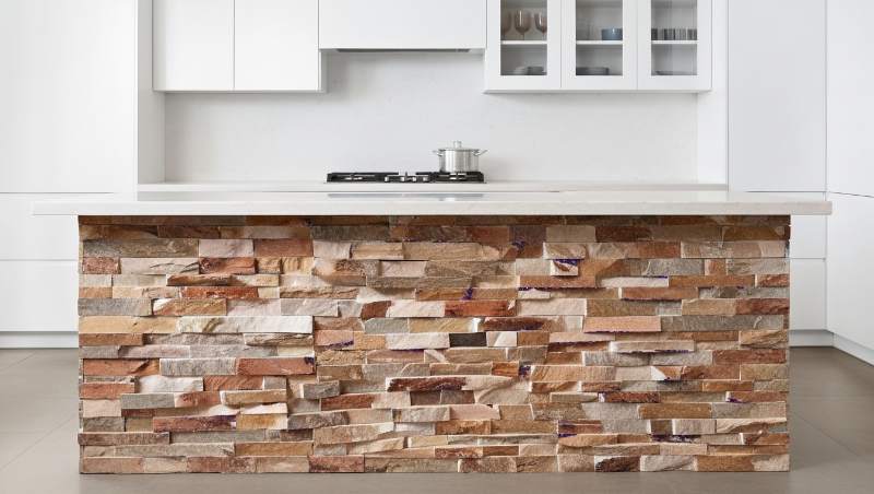
Can I use stone to accent a modern kitchen island base?
Yes, using stone on a kitchen island base is an excellent design choice. It grounds the center of the room and provides a durable, scuff-resistant surface for seating areas. This application instantly elevates the visual atmosphere through pattern and texture, balancing the clean surfaces of the island’s countertop and surrounding cabinetry.